

Email: Tel: 01827 768 286
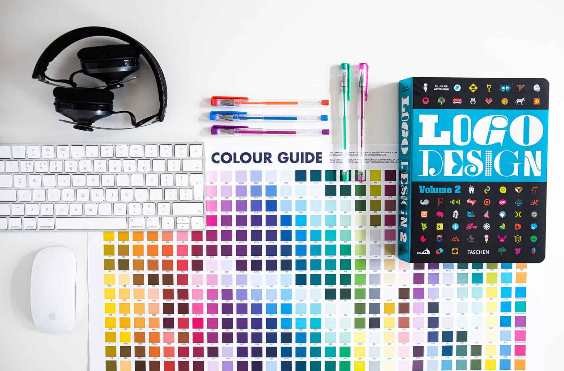
This article summarises our successful Logo Design Process. You’ll learn how to create a logo from start to finish. While every project is unique in scope, style, and industry, the logo design process is relatively sustainable. Simply put, it is responsible for understanding the user’s needs through questions and research, creating and developing concepts, and communicating and extending the design to all.
Let’s get started.
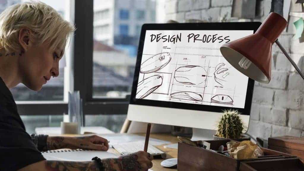
Developing a conceptual brief is the first step in every professional logo design process. We must ask questions and better understand the client’s business, market, and concerns to understand the client and their needs.
The client should be at ease if it’s over the phone, in person, via an online design questionnaire, or directly via email.
Finally, the design brief aims to aid the designer’s understanding of the project. The more they know, the more they will be able to interact with design concepts.
A creative design brief is a document produced collaboratively by the client and the designer. This brief focuses on a design or development project. It’s a series of about 10- 20 questions and’ll take about an hour to finish. We encourage clients to spend time completing it because the more complete the responses are, the better we can interact with the design concepts.
We use a branding questionnaire, which is broken down into several key areas:
Concerning your business –
About your messages –
About the Project –
Be sure to check out these other brand tips for more inspiration!
When the responses to the questionnaire are complete, we will go through and build a solid foundation for working on.
Additional questions may need to be addressed to understand the project.
We will look into the existing business (if it is not new) and determine where they are now with their branding. There may be aspects of their business that were not mentioned in the initial consultation.
Still, the critical point in finding consumers is understanding their issues further to provide the best solution.
Sometimes the client doesn’t understand ‘why’ their brand is struggling. An experienced brand consultant may offer concrete responses during the logo design process by analysing the current situation.
It is always essential to work in so many different industries, learning about the specific ‘niche’ in which the client operates. We examine their competitors to see what they’re doing. If they’re succeeding, we consider what they’re doing to be correct. If they’re doing something incorrectly, we’ll be able to identify what to avoid to help our clients excel quickly.
For a more detailed brand identity design method, we evaluate the brand’s research question using qualitative and quantitative research methods. Since this will take a long time, the lower-cost logo design packages may skip over this phase.
Qualitative research is usually a research study. We use it to discover problems, opinions, and objectives – it gives us insight into the whole situation and helps us identify trends in thinking and perception.
We will examine the client’s brand identity in more depth where possible. We will be looking into their brand alignment, including reports, brochures, and, of course, their website.
The strongest logos tell simple stories.
Sol Sender
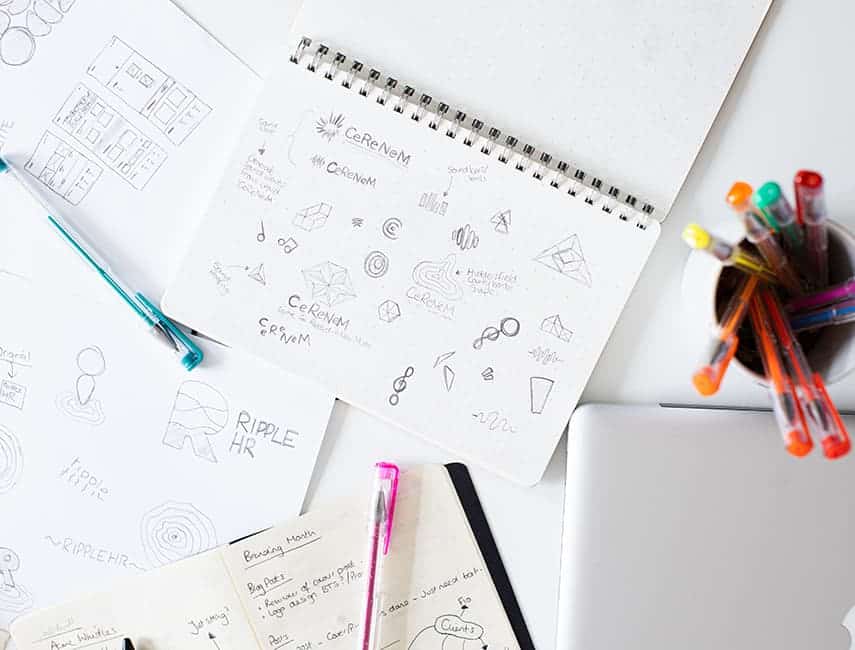
A sketch is the starting point for all effective logo design processes. Every project begins with pen and paper, whether a doodle on a napkin or a meticulously made pen sketch.
Combining a brainstorming session with sketching or doodling messages often produces the best results.
Moodboards will be collected from the beginning, from time to time, with the client’s help, who has submitted images that show the look or feel of what they want to communicate in logo design.
It can be difficult to describe ‘themes’ or colours in words, so we suggest the client send us some visuals if they can.
From the first sketch on a notepad, visual images and shapes are attractive and worth improving. At this point, we may move to a grid or dotted paper, redesigning and extending the original design and updating it with a pen for the next step.
Further logo sketches can be created using grids and drawn lines to balance better and organise items. Organic shapes can be made with a built-in grid regardless of how the logomark sits next to the logotype.
Although conceptualisation is known as ‘the creation of a concept,’ it is more of refining an idea by moving it to a computer. When viewed on a screen, the ‘idea’ takes on a new light, allowing us to spot any immediate flaws that might have gone unnoticed in the sketch.
The primary forms will be digitally captured using a scanner or manually reproduced within Adobe Illustrator. Getting digital conversions will enable you to make quick adjustments and refine your designs.
Before applying colours to any design, the logo design process in monochrome black-and-white shapes must be considered. These are the colour, light, and tone edges.
We’ve seen many poorly designed logos where the creator didn’t care how they would look in black and white. Overall, a logo design must look good in any format and any production.
We’ll start thinking about how the company name will be portrayed via the logotype as soon as we have some rough ideas for the logomark. We’ll have a general idea of the typography style we’re looking for, such as contemporary sans-serif or old-style serif.
Still, finding the perfect font for the job involves browsing through an extensive font library we use, Typekit.
If we want our communications to find anything that fits the bill, a ‘close-up’ font may be designed to suit the project’s needs.
This can be beneficial, as it creates a unique quality for the brand; however, extending it to a specific font could add to its costs.
Once we have a handful of brand-relevant fonts, we’ll explore how they look side-by-side with the previously created logomark symbols. Several selected colour palettes will be integrated into the design to determine the strongest.
The strongest brand concepts are gathered in a client presentation document at this stage. We show how the logo looks in various background colours, at different levels and some logo mockery, such as rendering the design on uniforms or vehicle packages. This helps users see their logo in a ‘real world’ setting rather than just on a page.
Other colour schemes can be provided to the client at this stage to aid the idea’s ability. As previously stated, colour is highly subjective, and even minor changes can significantly differ.
Maybe one of the colour tones is very vibrant, or a tone is too light. We can create some excellent options to suit every eye.
Attention is paid to ‘how’ the brand may be known in the future. We believe that a logo should be timeless rather than creating issues down the line or showing a date in a few years.
Showing clients what a concept will look like on a shirt helps them see it beyond its visual quality. We spend time ensuring suitable mockups are included so they will always be successful.
The first logo designs are exported in PDF format, allowing them to be viewed on-screen or printed at leisure. Printing is always recommended, as their computer monitor may not display colours correctly, and the embedded print profiles provide a more accurate representation. The presentation can range from 5-10 pages depending on the project’s scope.
While initial reactions are essential, we recommend that clients spend at least a few days with the concepts, if not a week.
Print them out, post them around the house or office, and let the eye wander over them randomly, just like a real viewer might when confronted with the brand.
Get input from trusted friends and family, and from regular employees who are familiar with the brand due to their involvement. Even if there are mixed opinions, they are all valid and provide guidelines for developing whatever is needed.
Afterwards, an appointment can be arranged, or feedback can be provided via email to move forward. Sometimes, we have more questions at this stage to get even more detailed feedback from the client.
We’ll spend some time explaining the ideas and gathering client feedback. The conversation could last anywhere from a few minutes if the client finds one of the concepts, to several hours if they have any doubts or questions that need to be answered and corrected.
It’s all part of a professional logo design process!
When we present original concepts to clients, we typically identify the strongest idea at the outset.
Demonstrating these intrinsic characteristics to the client is often part of the conversation.
So the result will vary significantly between projects, but overall, it is easier to develop the aesthetic aspect than the original. Such as another colour scheme or font can change the ‘look’, but it is much more difficult to change the meaning or significance.
We will try to develop a chosen concept based on client input and discussion. This could be minor changes to the colour scheme, looking at different versions, or showcasing other print types for consideration.
In almost all cases, one concept will be perfect for the client, but sometimes we have to go down two chosen paths, leaving the client unable to decide. Usually, only one or two developmental cycles are required at this stage, depending on an element of colour or style.
This phase involves a more focused approach, fully disseminating a single concept as in the original presentation. Other mockups, like stationery or business cards, could be presented as the next logical step.

A logo doesn’t sell (directly), it identifies.
Paul Rand
If the final logo design has been approved, the project does not stop there due to the client’s requirements. We can now proceed to the next stage of the branding process: brand extension.
As previously mentioned, business documentation is a good example. Letterheads, business cards, and other marketing materials can all be designed.
Local stationery dimensions must be considered based on the client’s physical location.
A letterhead supplied to a UK-based printer differs greatly from one supplied to a US-based printer.
We have created several templates suitable for the customer’s global situation, so it only works to build the specific versions.
From social network images to banners and headers, custom dimensions ensure everything looks perfect for the brand identity’s big release to the world.
This step of the logo design process is always individual to the client, as not every business would need external signs, for example. Uniforms may be required if you own a gym, but vehicle wraps may be a better fit if you own a car dealership.
Our logos are created in Adobe Illustrator in vector format, which can be exported to any format. AI (for potential editing, if desired), .EPS/.PDF (for printing), JPEG (for viewing), and .PNG (for displaying) are examples of popular file formats (with background-obvious information for web use).
The Vector file formats allow you to scale the full output range without losing quality or sharpness. This means a great logo on a business card would also look fantastic on a billboard.
The project’s final files will be conveniently organised to clarify where they will be used. All appropriate shapes and forms are included, along with monotone black-and-white versions for different background uses.
If any ‘layout’ designs exist, such as brochures or sales leaflets, files will be packaged in InDesign to use the images and fonts, where appropriate.
Brand guidelines are guidelines for how the brand will be presented to the world. They can be provided to a web developer who can quickly see the exact colour values for use on the website and what records are used in the content. Similarly, this guide can be sent to a printer to ensure maximum accuracy when printing documents using Pantone colours.
Everything is sent to the customer and emailed, CC’ing any additional staff who need access to the original files.
We want to ensure the client understands how to use the templates they paid for. So we’re available to provide immediate assistance or address any questions they may have in the future.
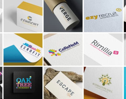
Let's get straight to it. Design isn't just about making things look pretty (though we're rather good at that).
Let's get straight to it. Design isn't just about making things look pretty (though we're rather good at that).